Customer Churn Analysis: Power BI Dashboard
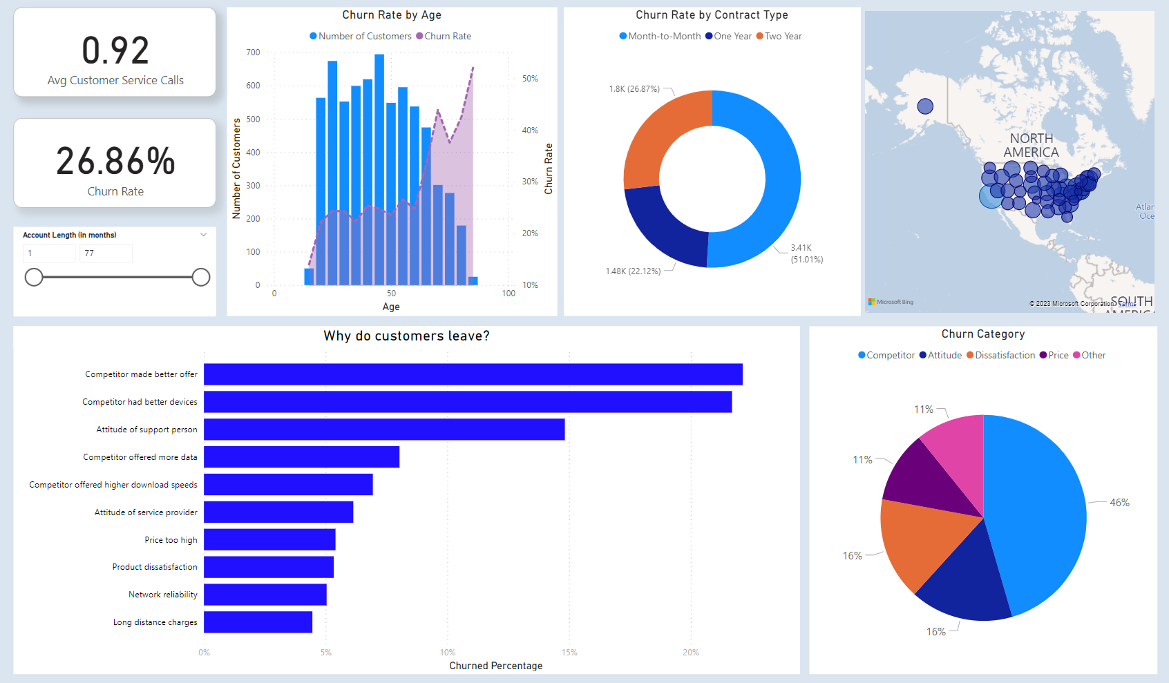
I have created a dynamic Power BI dashboard to illustrate Databel Telecom's Customer Churn Analysis. Through this dashboard, I've strived to provide a compelling visual narrative, shedding light on the factors behind customer attrition. By leveraging interactive data visualization, I aim to uncover insights into why customers choose to discontinue their services with Databel, empowering data-driven decision-making for retention strategies and business growth
Tool: Microsoft Power BI
View my Interactive PowerBi Dashboard on GitHub